Grubhubscub (talk | contribs) |
|||
| Line 174: | Line 174: | ||
#:Except since editors are having a problem with the visual aspect of these templates supposedly focusing on the theme itself rather than getting the point across does make it "broke". I would appreciate it if you were to change your reasoning to something less arguable since, due to [[COD:CON]] your three votes (and possibly a few others) should be overlooked due to its refutability. -- {{User:Azuris/sig}} 04:06, June 13, 2012 (UTC) |
#:Except since editors are having a problem with the visual aspect of these templates supposedly focusing on the theme itself rather than getting the point across does make it "broke". I would appreciate it if you were to change your reasoning to something less arguable since, due to [[COD:CON]] your three votes (and possibly a few others) should be overlooked due to its refutability. -- {{User:Azuris/sig}} 04:06, June 13, 2012 (UTC) |
||
#Im fine with the standard templates, they look fine to me...<span style="background-color:black; border:4px solid silver; {{border-radius|1em}}">.'''[[User:Necromancer115|<span style="color:silver">Necromancer</span>]][[User talk:Necromancer115|<span style="color:silver">115</span>]]'''[[File:MW Pickup Benelli M4.png|75px]]</span> 06:49, June 3, 2012 (UTC) |
#Im fine with the standard templates, they look fine to me...<span style="background-color:black; border:4px solid silver; {{border-radius|1em}}">.'''[[User:Necromancer115|<span style="color:silver">Necromancer</span>]][[User talk:Necromancer115|<span style="color:silver">115</span>]]'''[[File:MW Pickup Benelli M4.png|75px]]</span> 06:49, June 3, 2012 (UTC) |
||
| + | #I like themes, we're a Call of Duty wiki for a reason![[File:AdvancedRookieSig2.png|160px|link=User:AdvancedRookie]] 19:50, June 17, 2012 (UTC) |
||
===Neutral=== |
===Neutral=== |
||
Revision as of 19:50, 17 June 2012
Simply put, templates such as {{Delete}} are aimed at the editors who maintain the articles, who only represent a tiny minority of overall visitors. To everyone else, the big monolithic templates only act as an eyesore. As such, I propose we make the templates more minimalistic; while this may not be as fun for editors, it's better for the bigger picture. Smuff[citation provided] 17:23, May 13, 2012 (UTC)
Discussion
i agree. ![]() N7 TC 17:25, May 13, 2012 (UTC)
N7 TC 17:25, May 13, 2012 (UTC)
I like the idea. Have it as an addon to {{game}}. Phillycj 17:28, May 13, 2012 (UTC)
- How do you mean?
 N7 TC 18:50, May 13, 2012 (UTC)
- I think he means like the 'featured' is on it. Though I'd like to have a separate top icon set for them. Template:Sig/MLGisNot4Me 18:53, May 13, 2012 (UTC)
Philly's idea is good. I can make the image now :3 http://i.imgur.com/vm7BQ.png 17:49, May 13, 2012 (UTC)
Agreed. Template:Sig/MLGisNot4Me 17:51, May 13, 2012 (UTC)
Me gusta. Sgt. S.S. 18:25, May 13, 2012 (UTC)
Disagree, the themed templates are brilliant. ![]()

 18:52, May 13, 2012 (UTC)
- They take up gigantic portions of the page, are only helpful to the few users who edit the page, and quite a lot of them are really awkwardly phrased. (The AfD one is a perfect example.) According to the Admin Dashboard we got 2.3 million page views last week, how many of those were actually from contributing users? Smuff[citation provided] 19:21, May 13, 2012 (UTC)
hi -- <choose><option>azuris_</option><option> Azuristalk</option> 18:54, May 13, 2012 (UTC)
- fap
 N7 TC 18:59, May 13, 2012 (UTC)
- N7 came Smuff[citation provided] 19:21, May 13, 2012 (UTC)
While I agree with Smuff that the large templates are quite an eyesore, I also agree with COD4, the themed templates add a little bit of fun to our templates and make them seem much more friendly. Making every template alike and that same stale green makes everything seem too strict and dull in a way. Redskin-26 19:27, May 13, 2012 (UTC)
- I looked over a few of the templates, and yes a few of them are awkwardly phrased as Smuff said. But, they can easily be reworded. :3 Redskin-26 19:29, May 13, 2012 (UTC)
- Which is why something like Phillcj's idea would make sense, it's not an eyesore and you don't need to beat around the bush trying to make everything seem less imposing or worry about awkward wording. Smuff[citation provided] 19:31, May 13, 2012 (UTC)
Also, I'm not sure if this would just apply to improvement templates (like {{Delete}}) or other things like the spoilers template. Smuff[citation provided] 19:31, May 13, 2012 (UTC)
- Also, Mass Effect Wiki has a rather pretty spoiler template that doesn't take up the entire page and still can have a nice quote attached. Smuff[citation provided] 19:38, May 13, 2012 (UTC)
- Those kinds of templates would be pretty nice. Template:Sig/MLGisNot4Me 19:40, May 13, 2012 (UTC)
- We should definitely have something like
- Those kinds of templates would be pretty nice. Template:Sig/MLGisNot4Me 19:40, May 13, 2012 (UTC)
- Also, Mass Effect Wiki has a rather pretty spoiler template that doesn't take up the entire page and still can have a nice quote attached. Smuff[citation provided] 19:38, May 13, 2012 (UTC)
Spoilers for Modern Warfare 3 follow. |
- Or you could have the logo on both sides of the template (Up to whoever), and the logo could change with each game it's added to also! Smuff[citation provided] 20:03, May 13, 2012 (UTC)
Per Redskin and CoD4, I see no reason to take away themes on templates, a little light-hearted humor won't destroy the wiki, nor will it deter anybody just visiting the page. http://i.imgur.com/E2uiO5T.png SmilularTalk http://i.imgur.com/KNXWYe1.png 19:36, May 13, 2012 (UTC)
- Forcing themes on the templates makes half of them sound really awkward. Smuff[citation provided] 19:38, May 13, 2012 (UTC)
- So we can re-word them a bit. What regular person is going to be on the page like "Oh, that template is a little oddly worded, screw this website."? We're a wiki, not a government or very important site, be a little in-formal. http://i.imgur.com/E2uiO5T.png SmilularTalk http://i.imgur.com/KNXWYe1.png 19:42, May 13, 2012 (UTC)
- Either way, it doesn't detract from the fact are current templates are ugly as hell. Like I said above, Mass Effect Wiki has a rather pretty spoiler template and you could still keep your quotes. The pictures (and the subsequent colour schemes which try to match the picture) are half of what get in the way so much. Smuff[citation provided] 19:47, May 13, 2012 (UTC)
- K, then change them if you want, but you're making it sound like a couple templates that don't meet your standards are going to destroy the entire site. http://i.imgur.com/E2uiO5T.png SmilularTalk http://i.imgur.com/KNXWYe1.png 19:55, May 13, 2012 (UTC)
- To be fair, at school my friends were looking at the site and asked what those pictures were doing at the top. N7 TC 19:56, May 13, 2012 (UTC)
- Smilular, I don't know about you, but I'd rather have a neat template that tells me concisely what it is there for than a template with some corny modified quote and an irrelevant image. Sgt. S.S. 20:04, May 13, 2012 (UTC)
- Sgt. S.S., I don't know about you, but I rather have a few lighthearted templates ever now and then, rather then a ton of identical, stale, dull, Olive Drab Green templates everywhere. Redskin-26 20:09, May 13, 2012 (UTC)
- You can still have quotes, like we established above it's more the pictures and the awkward wording which could do with a rethink. Smuff[citation provided] 20:28, May 13, 2012 (UTC)
- Sgt. S.S., I don't know about you, but I rather have a few lighthearted templates ever now and then, rather then a ton of identical, stale, dull, Olive Drab Green templates everywhere. Redskin-26 20:09, May 13, 2012 (UTC)
- Smilular, I don't know about you, but I'd rather have a neat template that tells me concisely what it is there for than a template with some corny modified quote and an irrelevant image. Sgt. S.S. 20:04, May 13, 2012 (UTC)
- To be fair, at school my friends were looking at the site and asked what those pictures were doing at the top.
- K, then change them if you want, but you're making it sound like a couple templates that don't meet your standards are going to destroy the entire site. http://i.imgur.com/E2uiO5T.png SmilularTalk http://i.imgur.com/KNXWYe1.png 19:55, May 13, 2012 (UTC)
- Either way, it doesn't detract from the fact are current templates are ugly as hell. Like I said above, Mass Effect Wiki has a rather pretty spoiler template and you could still keep your quotes. The pictures (and the subsequent colour schemes which try to match the picture) are half of what get in the way so much. Smuff[citation provided] 19:47, May 13, 2012 (UTC)
- So we can re-word them a bit. What regular person is going to be on the page like "Oh, that template is a little oddly worded, screw this website."? We're a wiki, not a government or very important site, be a little in-formal. http://i.imgur.com/E2uiO5T.png SmilularTalk http://i.imgur.com/KNXWYe1.png 19:42, May 13, 2012 (UTC)
Looking though I think we should take a middle ground. We keep the templates small with perhaps just the CoD wiki logo (the one used in the forum header) as the image, but the text can have a quote, followed by what needs to be done. Also as most designs (infoboxes, navboxes) are using black we should make the templates black, not olive.
20:38, May 13, 2012 (UTC)
- Here's my example.
|
I had something different in mind for a compromise; how about making the templates simply smaller, or maybe at the bottom of a page instead? That way, it doesn't seem too out of place, and themes are kept. ![]() Lyra(SPNKR)is the bo$$
Lyra(SPNKR)is the bo$$![]() 21:09, May 13, 2012 (UTC)
21:09, May 13, 2012 (UTC)
- I'm not overly sure if I like solid black, maybe more of a gray black like the background maybe? Smuff[citation provided] 21:24, May 13, 2012 (UTC)
| This article is a stub. You can help Call of Duty Wiki by expanding it. |
&
Look okay to anyone? http://i.imgur.com/vm7BQ.png 01:38, May 14, 2012 (UTC)
- I'd nix the grey background. Having it just plain white should be sufficient. User:Sactage/s.js 13:21, May 14, 2012 (UTC)
Thoughts? http://i.imgur.com/vm7BQ.png 02:21, May 21, 2012 (UTC)
The idea of having the templates so attention-grabbing is to promote the betterment of the articles by its readers. Having a deletion template that draws a reader's attention will convince them to look into that article's AfD page and possibly raise a good point, whereas a template that is minimalistic will be passed over by most readers. Smuff has missed the majority of the reasoning as to why these templates have remained so large, in his reasoning that they only aid those that edit the articles, in that he has not considered the fact that they are primarily there so that readers who do not regularly check such pages as the AfD and ID may be subsequently inspired to do so. Joe Copp 01:51, May 14, 2012 (UTC)
- Per Joe. http://i.imgur.com/VwuEI.pngSXe Fiend · talkhttp://i.imgur.com/VwuEI.png03:58, May 14, 2012 (UTC)
- Yeah but at the same time you're completely missing the point of what the wiki is to begin with. Yes, the large templates are helpful for the editors, but >%90 of traffic is done by non-contributing anons who will, at best, comment on blogs. To the majority of the readers, the titular templates serve as nothing but an eyesore. Yes, I understand the editors at the wiki may enjoy the templates, but it's not the editors who make up the majority of this wikis readership. Smuff[citation provided] 13:11, May 14, 2012 (UTC)
- And I assume you're bringing this up as these anons have started complaining about them? 13:27, May 14, 2012 (UTC)
- Personally I haven't noticed any visible complaints from anons about the templates. Smuff[citation provided] 13:33, May 14, 2012 (UTC)
- If it's attention-grabbing we're focusing on, couldn't we consider making the text in the template larger? Kat's proposed stub template looks ideal -- the big font draws the eye quite well. Sgt. S.S. 19:18, May 14, 2012 (UTC)
- The largest reason we have such templates at the top of pages and so large and attention-grabbing is so readers are inspired and convinced to edit them. Joe Copp 13:50, May 16, 2012 (UTC)
- Then why are stub templates at the bottom of the page?
 DarkMetroid567okay 14:01, May 16, 2012 (UTC)
- Though it's probably not the reason, I think it looks silly (or at least not as good as the other templates) on top of the page. Template:Sig/MLGisNot4Me 14:04, May 16, 2012 (UTC)
- I wasn't aware that stub templates were to be placed on the bottom of pages. It wouldn't make a difference, however, because chances are that readers wouldn't have to scroll much, if at all, to see the template. Joe Copp 14:08, May 16, 2012 (UTC)
- Though it's probably not the reason, I think it looks silly (or at least not as good as the other templates) on top of the page. Template:Sig/MLGisNot4Me 14:04, May 16, 2012 (UTC)
- Then why are stub templates at the bottom of the page?
- The largest reason we have such templates at the top of pages and so large and attention-grabbing is so readers are inspired and convinced to edit them. Joe Copp 13:50, May 16, 2012 (UTC)
- If it's attention-grabbing we're focusing on, couldn't we consider making the text in the template larger? Kat's proposed stub template looks ideal -- the big font draws the eye quite well. Sgt. S.S. 19:18, May 14, 2012 (UTC)
- Personally I haven't noticed any visible complaints from anons about the templates. Smuff[citation provided] 13:33, May 14, 2012 (UTC)
- And I assume you're bringing this up as these anons have started complaining about them? 13:27, May 14, 2012 (UTC)
- Yeah but at the same time you're completely missing the point of what the wiki is to begin with. Yes, the large templates are helpful for the editors, but >%90 of traffic is done by non-contributing anons who will, at best, comment on blogs. To the majority of the readers, the titular templates serve as nothing but an eyesore. Yes, I understand the editors at the wiki may enjoy the templates, but it's not the editors who make up the majority of this wikis readership. Smuff[citation provided] 13:11, May 14, 2012 (UTC)
One of the biggest reasons I don't even bother reading the templates is because, as stated previously in the forum, the templates are eyesores. When I'm reading an article, I ignore the template as best as I can because it just looks so ugly, I don't even bother reading the damn thing. They may try to grab attention, but at least go gentle on the eyes and readers may actually read the template, like the template KATANAGOD made. That's just my two cents. DarkMetroid567okay 23:54, May 14, 2012 (UTC)
I see no trouble with them. There a large template at the top of the page, they aren't getting in the way of anything. http://i.imgur.com/KUDLq.png 01:47, May 15, 2012 (UTC)
- Per Damac. http://i.imgur.com/VwuEI.pngSXe Fiend · talkhttp://i.imgur.com/VwuEI.png 15:45, May 18, 2012 (UTC)
As other people have stated before, I prefer the big templates with pictures and quotes because I notice them. I usually don't pay any attention to the normalized templates. ![]() Poketape Talk
Poketape Talk![]() 22:49, May 18, 2012 (UTC)
22:49, May 18, 2012 (UTC)
- But like I said above, couldn't an alternative to a big picture and quote be a larger font size? The stub template that KATANA proposed has a large font that draws the eye quite well. I think something like that could work. Sgt. S.S. 08:59, May 19, 2012 (UTC)
- Yeah well you'd notice this as well, and it's not a monolithic template. Hell, it's a spoiler template and if anything should take precedence over templates for editors. Smuff[citation provided] 12:53, May 19, 2012 (UTC)
- I thought we decided the wiki wouldn't use spoiler templates for things that have been released for a while. Poketape Talk 02:18, May 21, 2012 (UTC)
- And...? Black Ops II releases in 5 months, we still use them. DarkMetroid567okay 02:35, May 21, 2012 (UTC)
- And...? Black Ops II releases in 5 months, we still use them.
- I thought we decided the wiki wouldn't use spoiler templates for things that have been released for a while.
- Yeah well you'd notice this as well, and it's not a monolithic template. Hell, it's a spoiler template and if anything should take precedence over templates for editors. Smuff[citation provided] 12:53, May 19, 2012 (UTC)
I have always believed that the templates are oversized, tasteless and needlessly use lame quotes. Though I haven't glanced at them recently, I feel that, as an editor and a reader, I don't need most of the initial page being a huge maintenance template. I like the smaller versions presented in this thread: they're smaller, neater and get the point across; whereas some of the templates we use are vague and confusing as to their actual purpose. In regards to attracting more attention, I disagree. A bigger template won't make the article improve any quicker. Those who can edit will see it because they look for it. Size doesn't have an impact on the speed or quality of edits. --Scottie theNerd 07:52, May 21, 2012 (UTC)
I still prefer the themed templates but if we were going to remove them Kat's template design is the one to use. I also think that part of the reason themed templates don't look very nice is because the solid black looks really, really well... bad, even if the theme of the wiki is dark. The original light green looks so much better. ![]() 11:07, May 21, 2012 (UTC)
11:07, May 21, 2012 (UTC)
Best of both worlds
Alright. Since people seem to like things both ways, here's exactly that; Neat small easy on-the-eyes templates with the themes still implemented!
 |
The Sergeant says, "This article needs more content, so stop messing around and add to it right now!"
|
 |
 |
 |
 |
Tell the article to standby; we're on our way. Out.
This article contains information about a subject that is scheduled to make an appearance in an upcoming game/DLC pack. Please do not add non-referenced or speculative content until it can be confirmed by the game's release. |
| This image contains compression artefacts. Artefacts are left behind by the compression method used in JPEG images. This image, therefore, is probably a JPEG or is JPEG-derived. If possible, take another screenshot with a similar or identical subject saved in the PNG format. If a replacement image is uploaded under a new name, replace this template with a speedy deletion tag. |
Let me know what you think! http://i.imgur.com/vm7BQ.png 12:06, May 21, 2012 (UTC)
To me, the smaller images make the images themselves look useless. If you could increase image size a little bit, I imagine it would look much better. DarkMetroid567okay 14:05, May 21, 2012 (UTC)
- I agree, can you make the images slightly bigger? http://i.imgur.com/VwuEI.pngSXe Fiend · talkhttp://i.imgur.com/VwuEI.png15:40, May 21, 2012 (UTC)
I still don't like the quotes. I really feel that they have no place on our templates. Sgt. S.S. 16:39, May 21, 2012 (UTC)
- Why?
 16:49, May 21, 2012 (UTC)
- They look out of place and are completely unnecessary, that's why. A template is capable of getting its point across without some corny one-liner. Sgt. S.S. 17:00, May 21, 2012 (UTC)
- Today I Learned that every quote in Call of Duty is a corny one-liner. 17:10, May 21, 2012 (UTC)
- Not all of them, but most of the quotes used on the templates really are corny and awkward-looking. The templates would look much better without them. Sgt. S.S. 19:27, May 21, 2012 (UTC)
- Not that it matters, but I don't like the quotes. I don't see why we can't have straightforward templates. --Scottie theNerd 12:18, May 22, 2012 (UTC)
- Per Scottie, the quotes are usually long and take up an amount of space. Simple templates still seem like the best choice, even if we leave the images in. Just rid of the quotes. DarkMetroid567okay 16:04, May 22, 2012 (UTC)
- Per Scottie, the quotes are usually long and take up an amount of space. Simple templates still seem like the best choice, even if we leave the images in. Just rid of the quotes.
- Not that it matters, but I don't like the quotes. I don't see why we can't have straightforward templates. --Scottie theNerd 12:18, May 22, 2012 (UTC)
- Not all of them, but most of the quotes used on the templates really are corny and awkward-looking. The templates would look much better without them. Sgt. S.S. 19:27, May 21, 2012 (UTC)
- Today I Learned that every quote in Call of Duty is a corny one-liner.
- They look out of place and are completely unnecessary, that's why. A template is capable of getting its point across without some corny one-liner. Sgt. S.S. 17:00, May 21, 2012 (UTC)
Not bad Kat, not bad. http://i.imgur.com/KUDLq.png 18:25, May 21, 2012 (UTC)
I made the images as big as they can; any bigger and they make the template bigger then its supposed to be. let me know what you think (Again) http://i.imgur.com/vm7BQ.png 22:15, May 21, 2012 (UTC)
- I'm actually quite liking it. The smaller template just works.
DarkMetroid567okay 23:52, May 21, 2012 (UTC)
- I like it. http://i.imgur.com/VwuEI.pngSXe Fiend · talkhttp://i.imgur.com/VwuEI.png 00:09, May 22, 2012 (UTC)
Vote
Moving along; It seems that people are split on the themes for the templates. Everyone seems to like the smaller design for the templates, Now we just need to vote on wither we keep the themes:
Keep the themes
- I personally think the themes belong on the templates. They're clever and look fine on the smaller versions. http://i.imgur.com/vm7BQ.png 11:19, May 24, 2012 (UTC)
- per Kat Twily Scratch-chan 11:23, May 24, 2012 (UTC)
- Because the themes are appropriate and look very nice when they're made smaller, like Kat has done. 11:26, May 24, 2012 (UTC)
- Per Kat. Template:Sig/MLGisNot4Me 11:34, May 24, 2012 (UTC)
- Nothing wrong with them. http://i.imgur.com/KUDLq.png 19:24, May 24, 2012 (UTC)
Well I'd rather have no size change but whatever.To elaborate on my support of keeping the themes, I find them to be an entertaining way to encourage editing.Poketape Talk 20:12, May 24, 2012 (UTC)- Per COD4. Redskin-26 20:21, May 24, 2012 (UTC)
- I like how the themes in keep with the wiki. Without them they're basically just Wikipedia rip-offs. 21:56, May 24, 2012 (UTC)
- Per Kat. http://i.imgur.com/VwuEI.pngSXe Fiend · talkhttp://i.imgur.com/VwuEI.png 23:10, May 24, 2012 (UTC)
- I'd rather have not size change, but if there is one, there is no need to change the themes. Conqueror of all Zombies 19:17, May 25, 2012 (UTC)
- Per my own reasoning above. Joe Copp 19:47, May 25, 2012 (UTC)
- If it aint broke, don't fix it. Phillycj 19:59, May 25, 2012 (UTC)
- Per Phillycj PierogiTalk 22:56, May 25, 2012 (UTC)
- Per Phillycj --Bats a.k.a Rarity Filly 05:02, June 3, 2012 (UTC)
- Except since editors are having a problem with the visual aspect of these templates supposedly focusing on the theme itself rather than getting the point across does make it "broke". I would appreciate it if you were to change your reasoning to something less arguable since, due to COD:CON your three votes (and possibly a few others) should be overlooked due to its refutability. -- <choose><option>
azuris_</option><option> Azuristalk</option> 04:06, June 13, 2012 (UTC)
- Except since editors are having a problem with the visual aspect of these templates supposedly focusing on the theme itself rather than getting the point across does make it "broke". I would appreciate it if you were to change your reasoning to something less arguable since, due to COD:CON your three votes (and possibly a few others) should be overlooked due to its refutability. -- <choose><option>
- Im fine with the standard templates, they look fine to me....Necromancer115File:MW Pickup Benelli M4.png 06:49, June 3, 2012 (UTC)
- I like themes, we're a Call of Duty wiki for a reason!File:AdvancedRookieSig2.png 19:50, June 17, 2012 (UTC)
Neutral
Remove themes
- The thematic templates are not immediately recognisable at first glance, often making it difficult to ascertain what needs improving. Clarity and simplicity of editing should not be sacrificed for an irrelevant image and a silly quote. Who are these templates aimed towards anyway? The reader won't understand what they're for and the editor doesn't need something fancy. --Scottie theNerd 12:45, May 24, 2012 (UTC)
- But why can't the editor have a light-hearted template. What is the big issue? Can the text not be read? 14:42, May 24, 2012 (UTC)
- Similarly, why can't the editor have a straightforward template? I don't see the big issue. I don't particularly care either way, but if I had to choose, I'd go with a plain and simple "This article has been nominated for deletion". Templates aren't meant for decorative purposes and should be as minimalistic as possible. --Scottie theNerd 07:36, May 25, 2012 (UTC)
- A few quotes to brighten up a template isn't going to hurt anyone. http://i.imgur.com/vm7BQ.png 06:00, May 31, 2012 (UTC)
- They're still unnecessary and far from humorous. Being the creator of the original one-liners on these templates, the comedic value is only remotely funny the first time you see them. And since these are maintenance templates, they will be on a considerable number of articles. If the same message can be conveyed without a poor (and frequently "updated") attempt at a pun, then by all means we should simplify. Bovell Talk | Contrib. 21:13, May 31, 2012 (UTC)
- They're still unnecessary and far from humorous. Being the creator of the original one-liners on these templates, the comedic value is only remotely funny the first time you see them. And since these are maintenance templates, they will be on a considerable number of articles. If the same message can be conveyed without a poor (and frequently "updated") attempt at a pun, then by all means we should simplify.
- A few quotes to brighten up a template isn't going to hurt anyone. http://i.imgur.com/vm7BQ.png 06:00, May 31, 2012 (UTC)
- Similarly, why can't the editor have a straightforward template? I don't see the big issue. I don't particularly care either way, but if I had to choose, I'd go with a plain and simple "This article has been nominated for deletion". Templates aren't meant for decorative purposes and should be as minimalistic as possible. --Scottie theNerd 07:36, May 25, 2012 (UTC)
- But why can't the editor have a light-hearted template. What is the big issue? Can the text not be read?
- I see no need for as Scottie theNerd stated, "an irrelevant image and a silly quote." Get rid of them. DarkMetroid567okay 14:34, May 24, 2012 (UTC)
- Yet you haven't explained why having them is bad in any way. 14:41, May 24, 2012 (UTC)
- Equally, you haven't explained why having them is beneficial in any way. Sgt. S.S. 19:23, May 25, 2012 (UTC)
- At least, it brings us some humour, and encourages us to follow the rule. This is not Wikipedia, where everything are straightforward and too much mainstream. Having them doesn't mean something bad.

 03:37, May 27, 2012 (UTC)
- So, you want to keep them because you think plain, functional and direct is too "mainstream", and you're amused by a quote and an image. I don't know about the "encouragement" (if anything, I have to do a double take to remember which template is which), but if this sort of aesthetic is the majority's cup of tea, then meh. I personally think "it's funny" is a piss-poor argument over cleanliness and clarity. --Scottie theNerd 03:43, May 27, 2012 (UTC)
- I did, it's in my support vote above... 11:48, May 27, 2012 (UTC)
- At least, it brings us some humour, and encourages us to follow the rule. This is not Wikipedia, where everything are straightforward and too much mainstream. Having them doesn't mean something bad.
- Equally, you haven't explained why having them is beneficial in any way. Sgt. S.S. 19:23, May 25, 2012 (UTC)
- Erm, you said they were nice and appropriate. That doesn't really state any benefits or present an argument with point any more valid than any of the oppose votes you've scrutinised so far. DrRichtofen (Talk) 11:07, June 2, 2012 (UTC)
- Yet you haven't explained why having them is bad in any way.
- The quotes and images on the templates simply don't look right, and the templates can look a bit awkward as a result. Removing the themes would make the templates look much neater. Sgt. S.S. 19:08, May 25, 2012 (UTC)
- Why don't they look right? 11:48, May 27, 2012 (UTC)
- I told you above, I think that the quotes look corny and out of place. Sgt. S.S. 15:44, May 27, 2012 (UTC)
- Why don't they look right?
- These have gotten way out of control since I created them, with incessant "updates" to template theme. Not only are the one-liners in an attempt to wiki-fy the quotes just plain terrible, these templates have become stickers that editors append to a page to make it look nicer. Are these templates even removed when the maintenance task is completed? Hardly is there any such discussion, and I fear that there is more done in the way of "improving" the visual style of these templates rather than heeding their intended warning/suggestion. Bovell Talk | Contrib. 02:52, May 28, 2012 (UTC)
- Per Bovell, the themes are awkward and are an eyesore. Smuff[citation provided] 22:22, May 31, 2012 (UTC)
- I believe the main focus of these templates is to get the point across - which, if users are having issues with the themed templates, doesn't seem to be working. I believe this or any other version of the templates that focus on what they are suppose to do while grabbing the attention of readers is much more beneficial for the wiki as an encyclopedia, rather than keeping the themes for no real benefit but rather for a personal choice for some users. -- <choose><option>
azuris_</option><option> Azuristalk</option> 20:02, June 10, 2012 (UTC) - Per all. N7 TC 20:06, June 10, 2012 (UTC)
- The majority of templates are for maintenance purposes. We don't need all that fluff that are quotes from various games. Form follows function. 222 talk 03:00, June 16, 2012 (UTC)
Comments
![]() Comment — Wait, you put an oppose vote under "Remove themes", does that mean you oppose removing the themes?
Comment — Wait, you put an oppose vote under "Remove themes", does that mean you oppose removing the themes?
13:47, May 24, 2012 (UTC)
- No, he doesn't. It's stated quite clearly in his reasoning, but he was opposing to the Keep the Themes part. Just a little bit of confusion. DarkMetroid567okay 14:34, May 24, 2012 (UTC)
- I find it funny someone put this comment at the bottom instead of leaving it with the comment it went with so now it's lost all precidence. 17:25, June 1, 2012 (UTC)
![]() Question — Are we gonna vote on template size after this or is that not happening?
Question — Are we gonna vote on template size after this or is that not happening? ![]() Poketape Talk
Poketape Talk![]() 03:48, May 25, 2012 (UTC)
03:48, May 25, 2012 (UTC)
- Not sure. Maybe we will vote about it (size, color) later. 04:13, May 25, 2012 (UTC)
- Not sure. Maybe we will vote about it (size, color) later.
![]() Comment — Many proponents are stating nothing more than "I'd rather not change it". Remember, we run on COD:CONSENSUS, which means that a vote is decided on the weight of its arguments, not the number of supporters or opponents. Reasons have been provided as to why the themes should be changed. I ask that the proponents elaborate on their reasoning. --Scottie theNerd 22:41, May 25, 2012 (UTC)
Comment — Many proponents are stating nothing more than "I'd rather not change it". Remember, we run on COD:CONSENSUS, which means that a vote is decided on the weight of its arguments, not the number of supporters or opponents. Reasons have been provided as to why the themes should be changed. I ask that the proponents elaborate on their reasoning. --Scottie theNerd 22:41, May 25, 2012 (UTC)
Should this forum close now? There hasn't been any activity for a while and the voting seems likes its over. http://i.imgur.com/VwuEI.pngSXe Fiend · talkhttp://i.imgur.com/VwuEI.png 17:56, June 10, 2012 (UTC)
Closed - Because this vote came down to a matter of opinion, it's a bit difficult to decide which side has the better argument. The majority of the reasoning behind the voters wanting to get rid of them consists primarily of "it doesn't look good," which I don't find to be sufficient for a consensus. Going off of the "if it aint broke, don't fix it" saying, I think that Kat's new templates should suffice. Joe Copp 03:54, June 17, 2012 (UTC)
- Re-opened - I suppose I'm going to be protesting the reasoning behind this closure. :| Because there is no way to tell what people are supporting. There is no support consensus whether or not to use Kat's templates or whether to use the current templates. As per COD:CONSENSUS, any quantity of users supporting/opposing something is outweighed by the quality of reasoning behind their vote. And, as I stated above, "if it ain't broke; dont fix it" does not apply to this situation as clearly there is something "broke" as users are having a problem with the templates not performing their purpose of asking for maintenance. The use of Kat's templates could effectively not even fix the problem here, as they are arguably not performing as they should (and not even fixing the problem with the old templates - just making them smaller). -- <choose><option>
azuris_</option><option> Azuristalk</option> 05:13, June 17, 2012 (UTC)
New vote
This is a new vote that stands to make things more clear. Please try to make sure your votes contain logic to them as opposesd to seeming to oppinated.
05:37, June 17, 2012 (UTC)
Keep as they are
- To be honest, I don't see a problem with the templates the way they are. I never thought they were an eyesore or anything like that. I.W. F.T.W. (talk) 18:16, June 17, 2012 (UTC)
- It never came across to me that the old ones "got in the way" and thought they served their service well, per IW as well.
 Argorrath おしゃべり
 18:19, June 17, 2012 (UTC)
Use Kat's versions
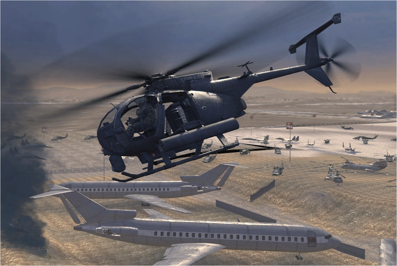
- These versions make the templates take up less room, yet still keep them eye catching. Also "Are these templates even removed when the maintenance task is completed? Hardly is there any such discussion" can be argued as on the Attack Helicopter page there was a non-themed merge template, it had been there for a long period of time, so clearly removing the themes makes them less noticable and will just clutter more. 05:37, June 17, 2012 (UTC)
- I like them, I believe they take up a middle ground for them not being too much of an "eye sore" and still there to get the point of what needs to be done across to users who will actually find them useful. Also Per Samuel. http://i.imgur.com/E2uiO5T.png SmilularTalk http://i.imgur.com/KNXWYe1.png 05:59, June 17, 2012 (UTC)
- Sexy templates are sexy. and per all. http://i.imgur.com/vm7BQ.png 08:05, June 17, 2012 (UTC)
- They look nice, take the attention they need but aren't a huge eyesore. Per all. --MLGisNot4Me talk 09:55, June 17, 2012 (UTC)
- Because it allows us to keep the theming while also maintaining a small, noticeable, readable and understandable notice. 13:10, June 17, 2012 (UTC)
- I like this idea. Per all. Joe Copp 14:06, June 17, 2012 (UTC)
- I like KAT's templates, they are small and they do get the point across. http://i.imgur.com/VwuEI.pngSXe Fiend · talkhttp://i.imgur.com/VwuEI.png 18:27, June 17, 2012 (UTC)
Remove themes altogether
- In the original format the titular templates are an eyesore, for Kat's compromise suggestion the images serve no purpose being there, and in general, bar perhaps the {{sdelete}} template, the themes are awkward and cheesy. Just because they can be themed doesn't mean they should. Smuff[citation provided] 19:48, June 17, 2012 (UTC)
Comments
As sort of a way to have the best of both worlds, we could try to use templates like this one here (though definitely not this template itself because it sucks - fml) that has a thematic picture in the background as well as text that gets the point across. These would be attention-grabbing and not be occupied by stupid quotes. So somebody who's good with this shit go ahead and make a better one (for the love of God make a better one please) that we could use for our article templates (we can also use different pictures for each template - as long as that doesn't get out of control with users trying to change them). (more parenthesis) -- <choose><option>azuris_</option><option> Azuristalk</option> 06:55, June 17, 2012 (UTC)
- While the thought is good.. I just don't see that working. The templates I created are.. alot better even if yours were more refined and perfected. It looks like they'd be bulky and take up even more space from what i see. http://i.imgur.com/vm7BQ.png 08:08, June 17, 2012 (UTC)
- I like this concept but the issue here is that they are too big. I do like how it looks though. 13:10, June 17, 2012 (UTC)
- You're misunderstanding the point of the templates - it's too get users to read them and perform maintenance tasks. And, while I know that these aren't the best (hence I asked for somebody who knows what their doing to make a better version of the template), I personally (since this is the matter of looks) do not prefer Kat's templates because they are small, compact, and able to be easily ignored. -- <choose><option>
azuris_</option><option> Azuristalk</option> 17:52, June 17, 2012 (UTC)
- You're misunderstanding the point of the templates - it's too get users to read them and perform maintenance tasks. And, while I know that these aren't the best (hence I asked for somebody who knows what their doing to make a better version of the template), I personally (since this is the matter of looks) do not prefer Kat's templates because they are small, compact, and able to be easily ignored. -- <choose><option>
- http://i.imgur.com/6lvHI.png is what I mean. The templates are too small, the pictures look fairly stupid, and the templates look way too long in comparison to the size of the page. -- <choose><option>
azuris_</option><option> Azuristalk</option> 18:18, June 17, 2012 (UTC)
- http://i.imgur.com/6lvHI.png is what I mean. The templates are too small, the pictures look fairly stupid, and the templates look way too long in comparison to the size of the page. -- <choose><option>